
Bisons do not run from the storm; collectively, they turn to face it as one. That instinct speaks to the spirit of the University of Manitoba resilient, unified, and bold in the face of challenge.
The University of Manitoba Bisons have entered a new era with a refreshed identity that reflects strength, unity and pride.
More than just a logo, it represents a renewed commitment to the spirit and community that connects student-athletes, coaches, alumni and fans as One Herd.
Honouring tradition, looking to the future
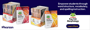
The refreshed brand includes a forward-facing bison that celebrates the tradition while infusing fresh energy into the next era of Bison Sports excellence. It maintains the iconic brown and gold deeply rooted in Bison Sports history while incorporating blue elements that align with UM's primary colour palette to ensure visual cohesion with the university's broader brand.
"We are proud to reveal the refreshed look for this next chapter of Bison Sports history," says UM President Michael Benarroch. "In the same way our student-athletes continue to redefine what success looks like, both on the fields of play and in their communities, we wanted a redefined look that encompasses the legacy of the Bisons while reflecting the vibrancy of our future."
For more than two decades, the former Bison Sports logo served as a proud symbol donned by student-athletes as they competed and excelled on the national stage. Worn during many triumphant moments, it represented pride and determination as countless accolades were earned, including last season's 2025 U SPORTS women's volleyball title.
"We wanted a redefined look that encompasses the legacy of the Bisons while reflecting the vibrancy of our future."
Shaped by the Herd
The refresh process began in 2024 with consultations across a wide range of stakeholders including student-athletes, coaches, volunteers, parents, Recreation Services members, members of the Indigenous community, and others. Input was gathered through focus groups, a quantitative survey and brand audit to shape an identity grounded in voices from across the community.
"It was crucial to us that this process involved as many stakeholders from the community as possible," says Douglas Brown, Dean of the Faculty of Kinesiology and Recreation Management. "The Bison means so much to so many people, so we wanted to ensure their voices were heard."
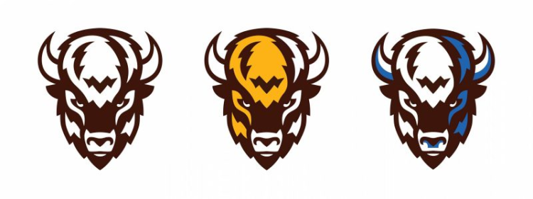
The new forward-facing bison symbolizes strength and determination, while the return to true brown and gold honours the past and unites all eras under One Herd. Clean lines, vibrant tones, and dynamic design elements, including a custom sports serif typeface inspired by bison hooves and horns, position the Bisons as confident, cohesive, and ready to face what comes their way. Every element was designed to foster belonging, pride, and the enduring spirit of resilience that defines the Bisons.
"It's been no small undertaking to get to this place," says Gene Muller, Director of Athletics and Recreation at the university. "It's been a tremendous amount of effort from people across the university to create this new identity for Bison Sports, and we couldn't be prouder of the hard work and care they've put in."
"It was crucial to us that this process involved as many stakeholders from the community as possible."
Colours of legacy
Brown and gold are deeply rooted in the Bisons' identity, representing decades of achievements and traditions. The colours evoke warmth, resilience, and stability. Brown embraces the spirit of our core symbol-strength, determination and leadership. Gold symbolizes the Bisons' pursuit of excellence, energy and achievement qualities that resonate with athletic and academic success.
Looking ahead
All student-athletes will compete under the new logo beginning in the 2025-2026 season, including the highly anticipated 2026 U SPORTS National Track and Field Championships, March 5-7, 2026, hosted at the University of Manitoba.
"The unveiling of a new logo and getting to be a part of this is really special," says Skyler Bruce, a second-year Bison on the men's hockey team. "The name and look of the Bisons means something in Manitoba, and I think we will all look back on this as a very special time."
Muller says he is excited to see the connection displayed so proudly. Muller says this new look "embodies everything it means to be a Bison and lead boldly."
"The name and look of the Bisons means something in Manitoba."
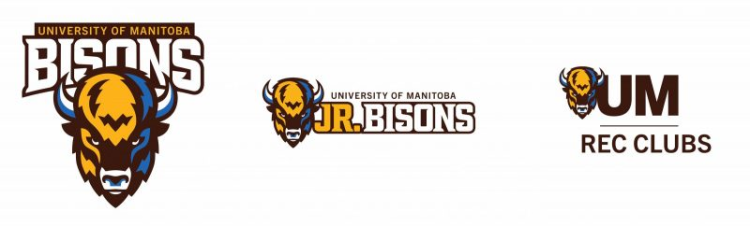
Starting this fall, our Junior Bisons teams and competitive rec club teams will also be sporting their own updated logos, which integrate the forward-facing bison head. These logos create a powerful visual representation of our collective strength as one herd and reflects the spirit and excellence of our programs and our institution.
Celebrate the new era at the Bisons Block Party
Join us for a public celebration of the new Bisons brand at the Bisons Block Party, happening September 20 from 12 to 5 p.m. during the Homecoming football game. In addition to the game, day's events will feature a kid's zone, Billy the Bison's birthday party, speaker series and alumni lounge.
Tickets for the event are free using the promo code HOMECOMING25.
Merchandise with the new logo will also be available at Homecoming in the UM Bookstore and online after the event.
